Working with Properties
The right panel displays all available properties for the selected block.
To view or edit a block's properties, click once on the desired block so that a border appears around it.
Properties are divided into the following categories:
- Block – block properties such as padding, border radius, background colors, etc.
- Image – image properties including alt text, links, and the image itself
- Buttons – button properties such as colors, sizes, border radius, and links
Block Properties
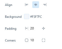
Block properties
Depending on the selected block, you can modify the following in this section:
- Align – horizontal alignment: left, center, or right
- Background – background color of the block. You can enter a color code or click the preview to choose a color from the palette:
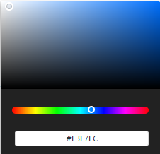
Color picker
- Padding – inner spacing. You can enter a single value for uniform padding or click the icon on the right to specify different values for each side
- Corners – border radius. You can enter a single value to round all corners equally, or click the icon on the right to set individual values for each corner
Image Properties
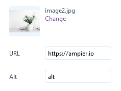
Each image block has the following properties:
- Image – click change to upload or replace the image
- URL – link address for the image (leave empty if you don’t want the image to be clickable)
- Alt – alternative text for the image
Button Properties
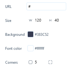
Button properties
The following properties are available for buttons:
- URL – link address for the button
- Size – button dimensions, where W = width and H = height
- Background – background color of the button (you can enter a hex code or use the color picker)
- Border color – border color (enter a hex code or use the color picker)
- Font color – text color (enter a hex code or use the color picker)
- Font family – font family
- Font size – font size
- Corners – border radius. Enter one value for all corners or click the icon on the right to set each corner individually