Mobile Adaptation
The mobile adaptation tool allows you to control how columns within a block rearrange or change their width on mobile devices.
The settings become available when a block contains more than one column.
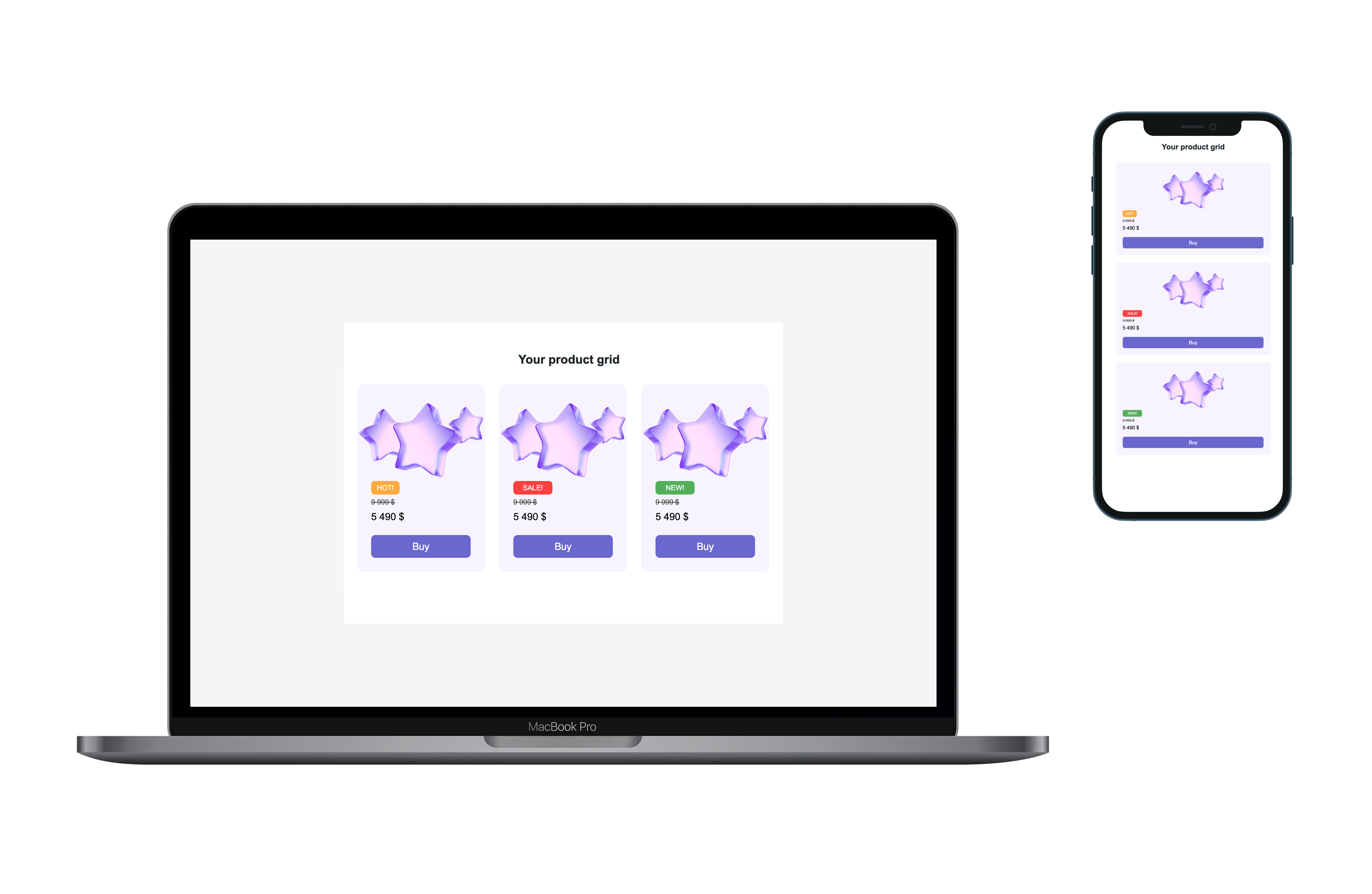
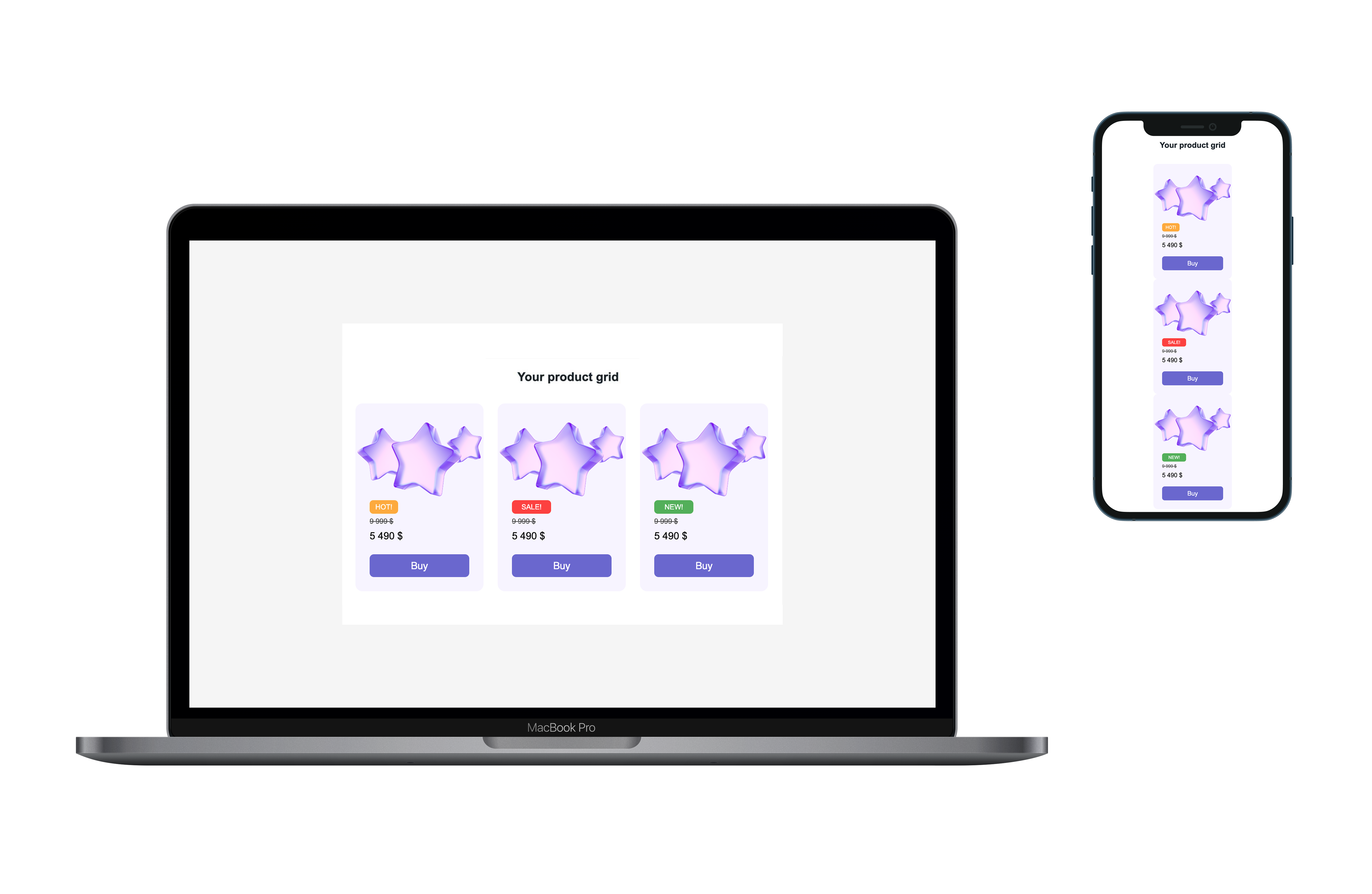
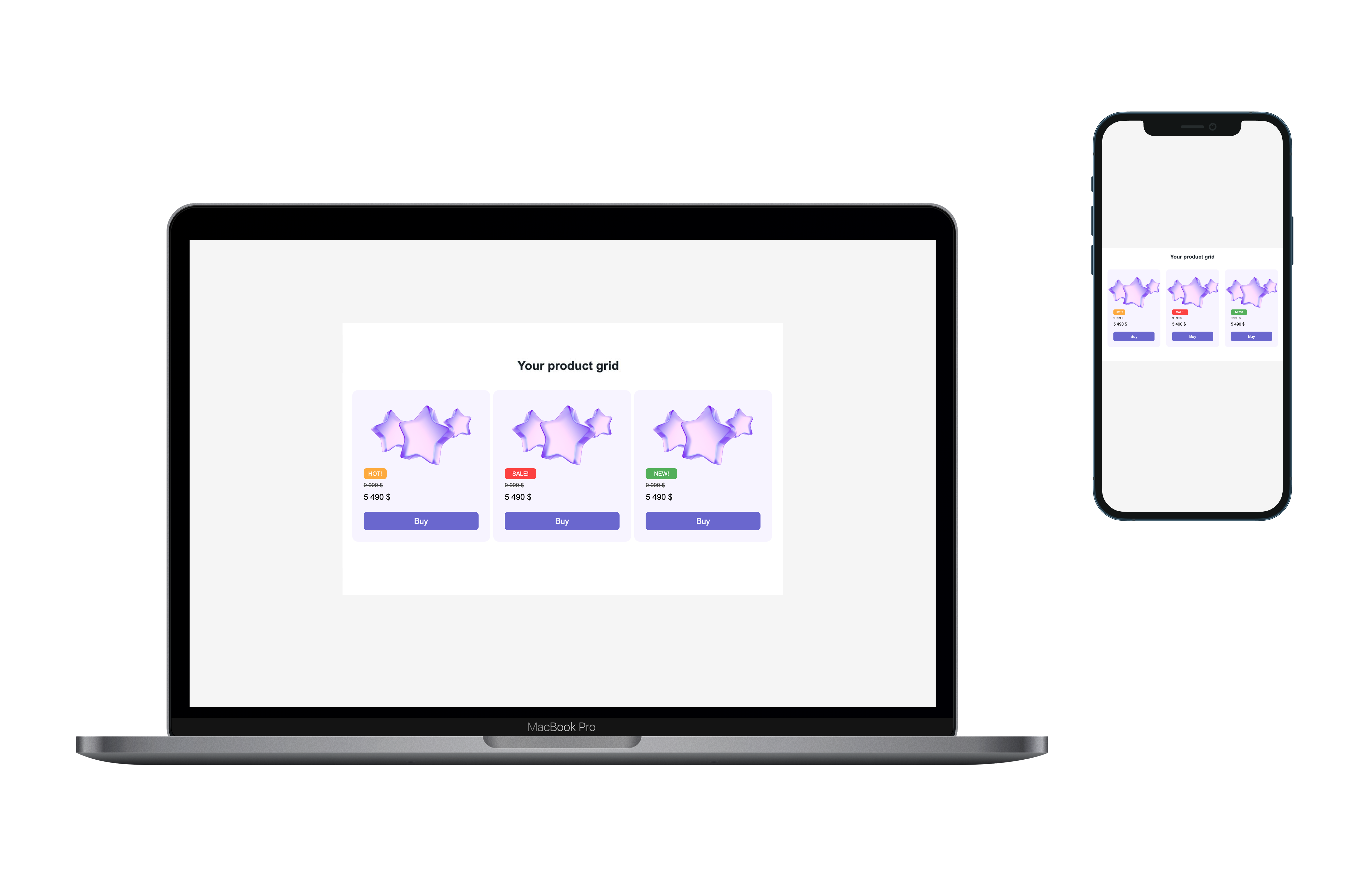
Adaptation Options
Rearrange with expansion
Columns are rearranged into a single column and expanded to the full width of the screen. Available for any number of columns.
Rearrange without expansion
Columns are rearranged into a single column without being stretched. Available for any number of columns.
Compress without rearranging
All columns remain in a single row and are reduced in width. Available for any number of columns.
Rearrange 1+2 with expansion
The first column is placed on its own row, while the remaining two columns are displayed below in a single row. Available for 3 columns.

Rearrange 2+1 with expansion
The first two columns are combined into one row, and the third column is moved below and expanded to full width. Available for 3 columns.
Rearrange 2+2 with expansion
Two columns are displayed in the first row and two in the second row. Available for 4 columns.

When media queries are not supported
In environments where media queries are not available, the default behavior is applied: Rearrange without expansion for any rearrangement, or Compress without rearranging.
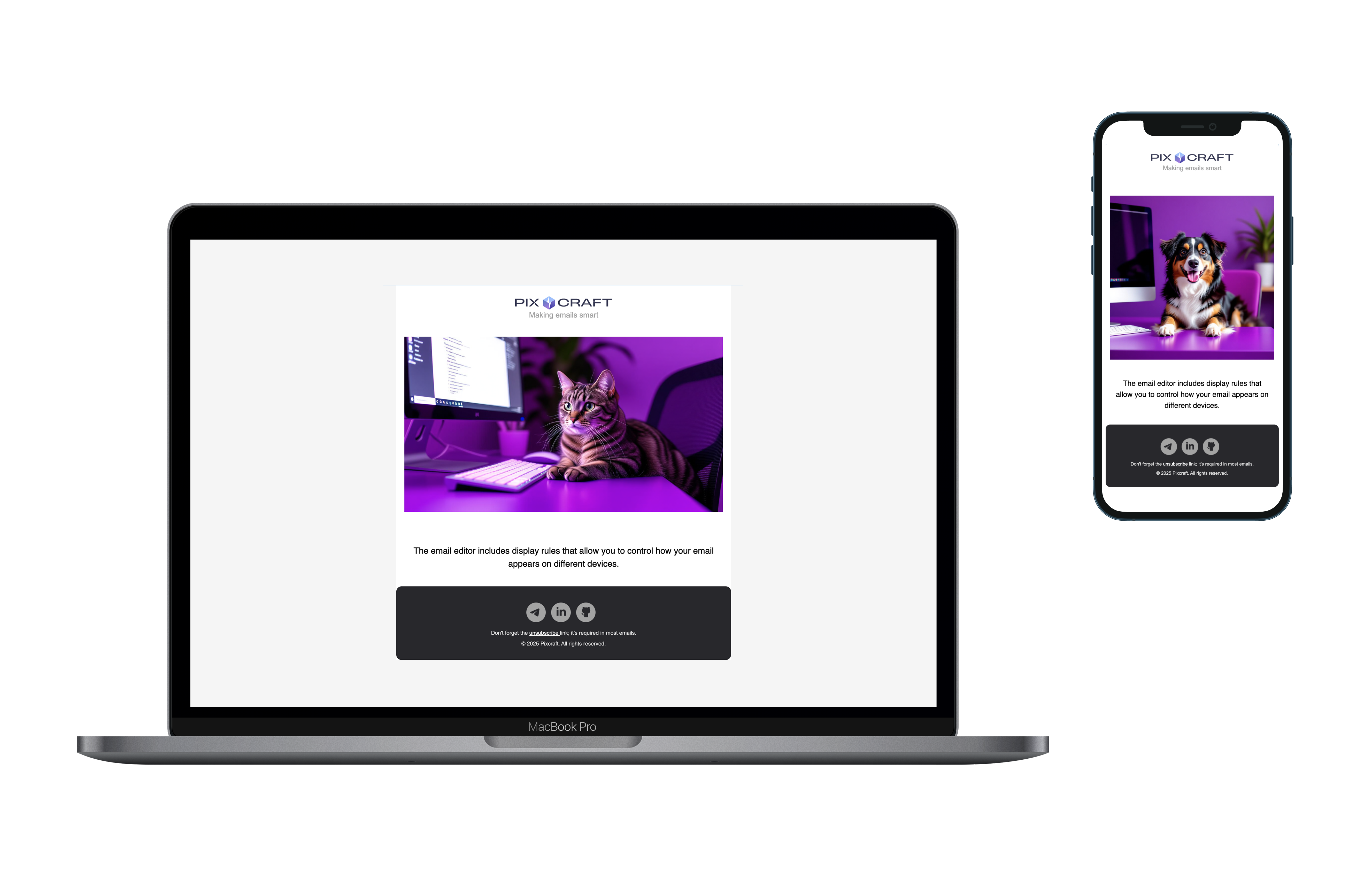
Element Display Rules
For any element (except a column), you can define display rules:
Everywhere
Desktop
Mobile
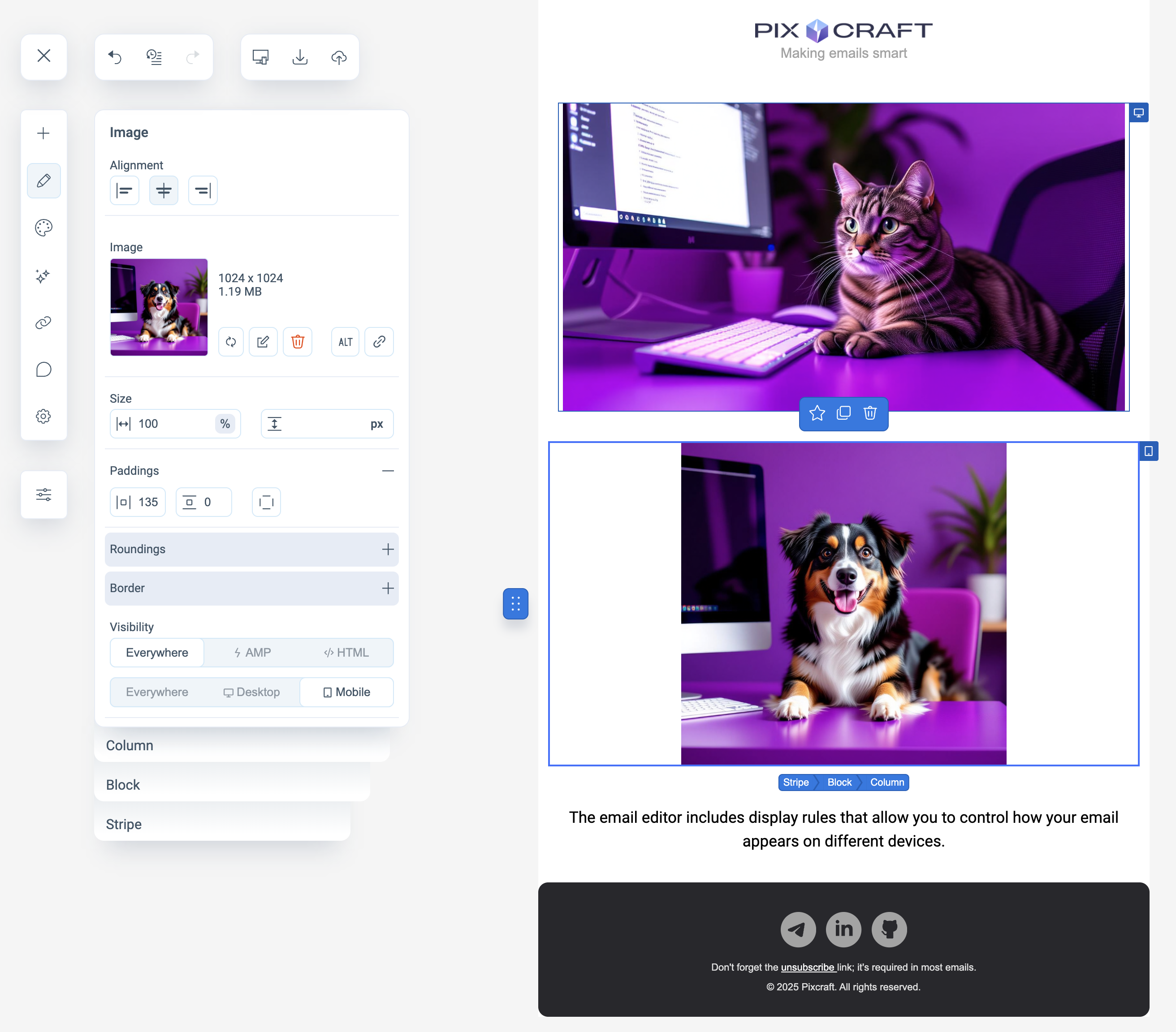
This allows you to show different elements depending on the device.
For example, within a block you can add:
a horizontal image — displayed only on desktop
a square image — displayed only on mobile devices