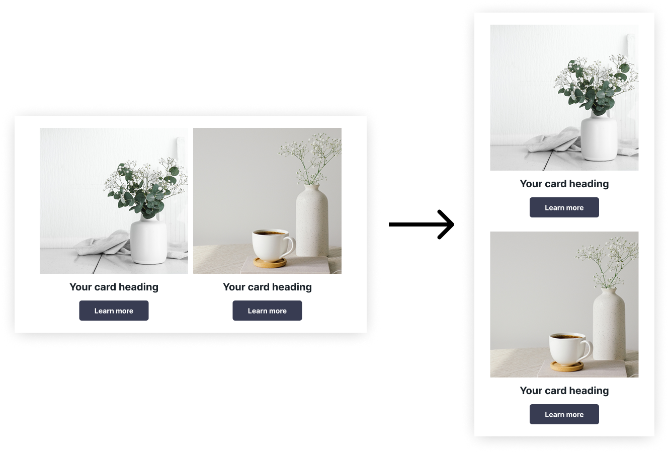
Stacking blocks
For horizontal frames, the plugin automatically determines how they should adapt in the mobile version based on their width. For example, if the width of the first block is small, such blocks will not be restructured—the first block's width will be fixed, and the second block will shrink to fit the screen. This structure is typical for bulleted (or numbered) lists, so the behavior is similar.
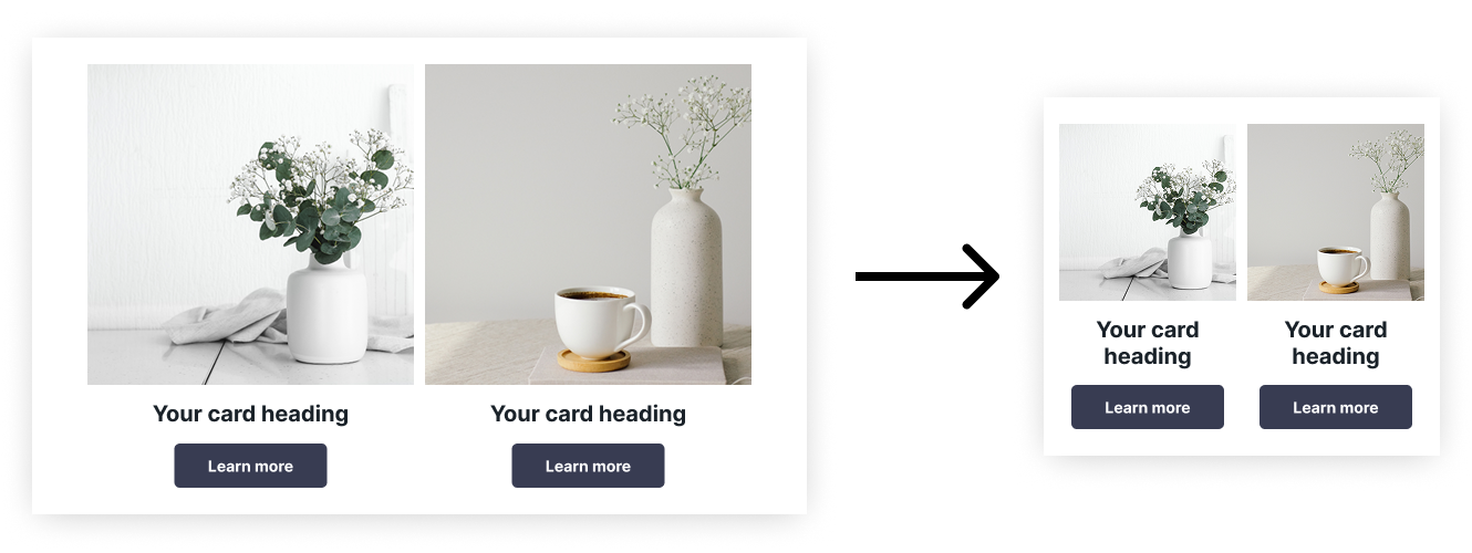
Reflowing Blocks
In most cases, blocks within horizontal frames will reflow. However, in some situations, you may need to explicitly specify that blocks should be reflowed (when they don't fit the screen). To do this, use the Autolayout: Wrap mode.
Responsive Blocks
In some cases, you may want blocks to stay on the same row and adapt to the container's width. To achieve this, use the spacing setting with the value auto (previously known as "space between").
It's better if the actual spacing in this case is zero.
To maintain proportions during scaling, open the properties tab in the Pixcraft plugin and enable "relative width."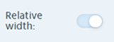
Scalable Blocks
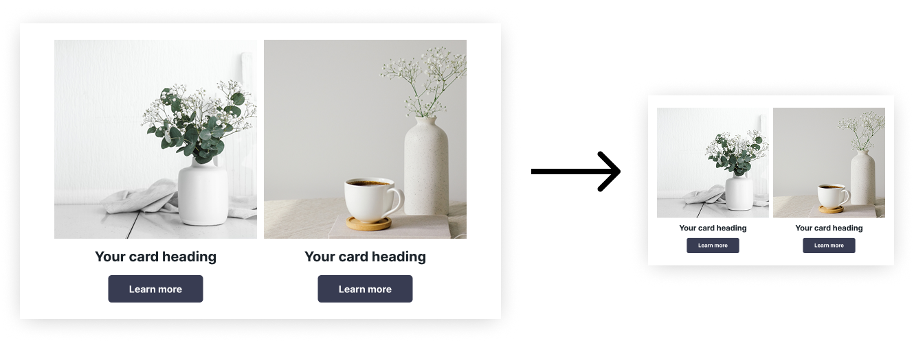
Full scaling (including text) without media queries can only be achieved using images. To get this effect, group each column and apply auto spacing between elements in the horizontal frame, as described in the section above.
Reverse Block Reflow
Mobile adaptation in emails is often achieved by rearranging blocks on top of each other when they no longer fit on the screen.
However, there are situations where direct rearrangement of blocks is not suitable. For example, with a chessboard arrangement of blocks - one block needs to be rearranged directly and the other - in reverse:

To do this, select the block with two horizontally arranged frames, and choose the second option in the Properties tab, in the parameter "Reverse display of columns in the mobile version:"